Usability Testing
Methods
Selected Research Artifacts
The full PDFs are available for deep review. These report-slide exports put the research work on the page: what was tested, what broke, and how the findings were communicated.
Independent graduate UX research case studies. Not affiliated with or commissioned by the brands shown. Screenshots and brand references document the tested public interfaces and research findings.

Why This Collection Exists
Usability testing is not one skill. Moderated and unmoderated sessions surface different kinds of data. Writing a usability brief requires a different kind of thinking than running a session. Planning a test for a prototype that does not exist yet is a different problem than evaluating a live product.
These five projects each applied a different usability method to a different product. Together, they demonstrate range across the core skill set that usability work actually requires: facilitating sessions, coordinating with other facilitators on a shared study, designing studies, choosing metrics, working with remote testing platforms, and planning evaluations for prototypes still in development.
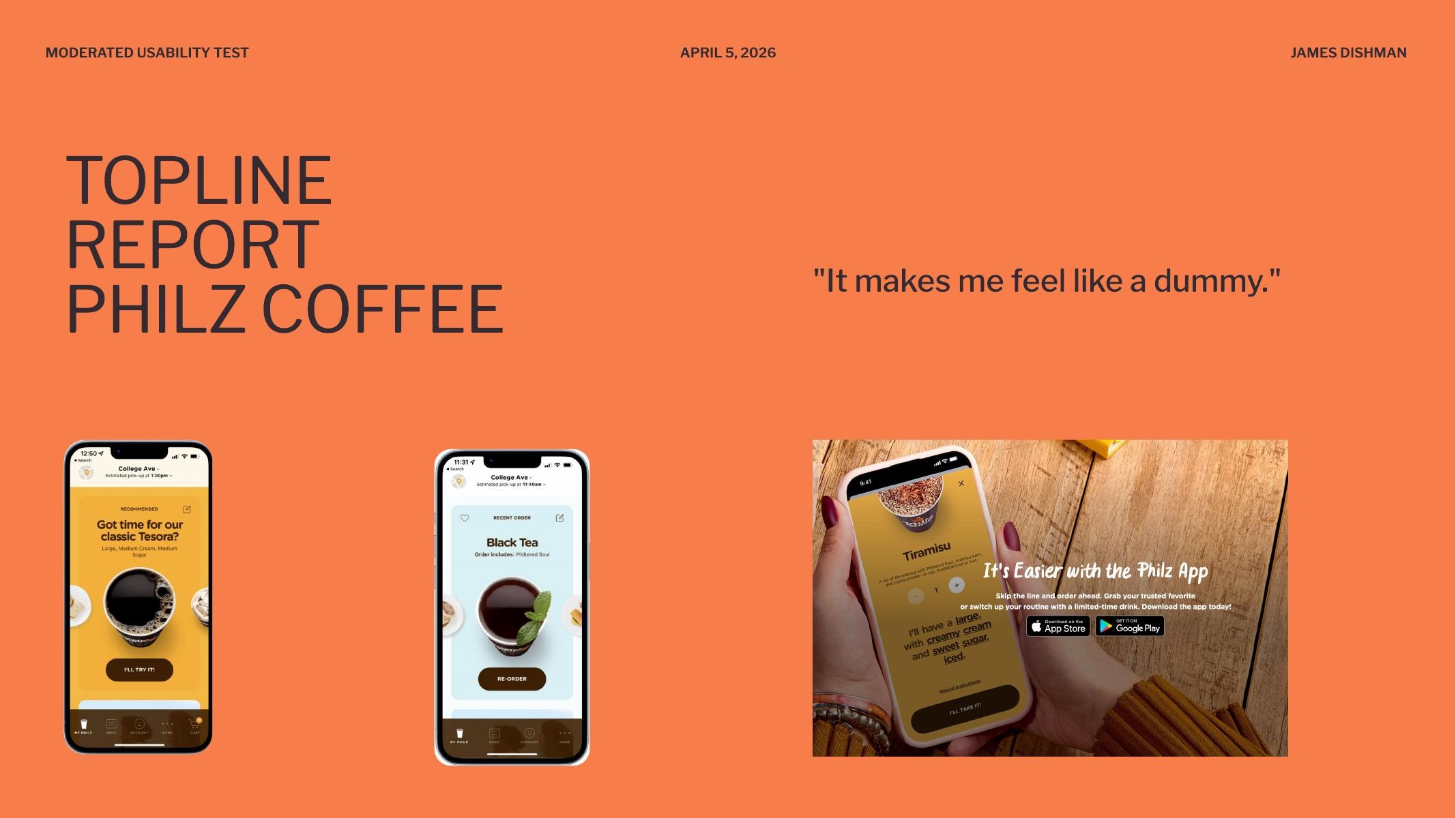
Moderated Mobile Usability Testing: Philz Coffee App
Year: 2026
A 15-participant moderated usability study of the Philz Coffee mobile ordering app, run across five facilitator groups (Stacy, Tarun, Liz, Paige, and me) on iOS, Android, and the web. Five tasks per session: find and download the app, select a store location, customize an order using the modifier system, place a drink order with special instructions, and manage the cart through checkout. The goal was to identify friction in the mobile ordering experience, with particular attention to whether users could understand and effectively interact with the app's touch-based controls.
One participant's line during the modifier task became the title of the topline report: “It makes me feel like a dummy.” That sentence is the study in miniature. The app is not unusable. It is built on interaction conventions that the people using it do not recognize, and the consequence is that intelligent adults blame themselves for the interface.
Evidence Boundary
I am not embedding raw session footage here until the clips are cleared and edited. This case study uses anonymized participant language, task-level failure patterns, and aggregate counts instead of treating private interview video as portfolio decoration.
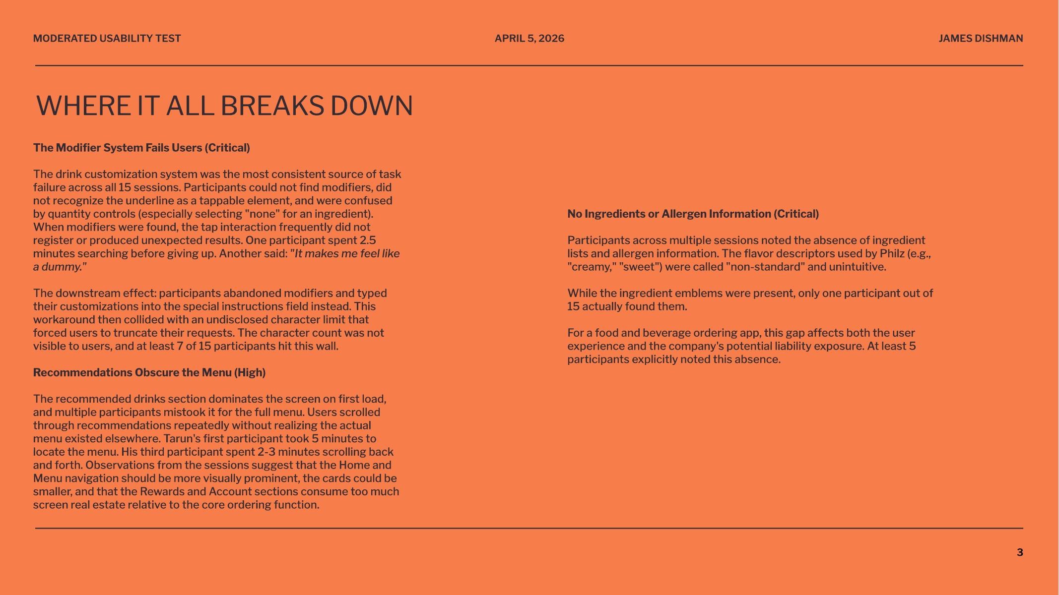
Critical Finding: The Modifier System Fails Users
The drink customization system was the single largest source of task failure across all 15 sessions. Roughly 8 to 10 of 15 participants could not successfully customize a drink using the app's built-in modifier controls. The controls rely on an underline visual convention to signal “tappable,” but participants did not recognize the underline as an interactive element. When they did attempt the tap, the interaction frequently failed to register or produced unexpected results. One participant spent two and a half minutes searching before giving up.
The affordance failed across age groups and platform familiarity, but skewed harder against older participants. Their natural tap behavior produced null results, which led them to assume the controls were display-only rather than interactive. The interface was punishing them for following standard mobile conventions.
Critical Finding: The Workaround Hits an Invisible Wall
The downstream effect of the modifier failure is that participants abandoned the modifier system entirely and typed their customizations into the special instructions field instead. That workaround then collided with an undisclosed character limit that forced them to truncate their requests mid-sentence. The character count was not visible. At least 7 of 15 participants hit this wall. The keyboard also covered the text input area on mobile, so participants could not see what they were typing while they were typing it.
High-Severity Finding: Recommendations Obscure the Menu
The recommended drinks section dominates the screen on first load, and multiple participants mistook it for the full menu. Users scrolled through recommendations repeatedly without realizing the actual menu existed elsewhere in the app. One facilitator's first participant took five minutes to find the menu. Another spent two to three minutes scrolling back and forth. The information architecture punishes the most instinctive mobile gesture, scrolling down to see more, by trapping users in a section that does not lead them to the core ordering flow.
Critical Finding: No Ingredient or Allergen Information
Across multiple sessions, participants noted the absence of ingredient lists and allergen information. The flavor descriptors used by Philz (“creamy,” “sweet”) were called “non-standard” and unintuitive. Ingredient emblems exist in the app, but only one participant out of fifteen actually found them. At least five participants explicitly flagged this absence on their own.
For a food and beverage ordering app, this is not just a usability gap. It is a potential liability exposure. Naming the business risk alongside the user impact is part of what makes a usability finding actionable to a stakeholder who does not care about heuristics.
What Worked
Cart and checkout was the most consistently successful task across all sessions. Participants found removing items, changing quantities, and completing checkout straightforward on both platforms. Location selection also performed well. The drink category structure (coffee and tea separation) made sense to participants once they reached it, and was described positively. Younger participants tended to navigate with less friction than older or less tech-familiar participants, which suggests the interface depends on conventions that are not yet universally understood.
Primary Recommendation
Redesign the modifier interaction to use clearer visual affordances (toggles, steppers, or labeled buttons) with immediate visual feedback on selection. Reduce the screen real estate given to recommendations and make the menu navigation more prominent. Surface ingredient and allergen information at the point of product selection, and replace ambiguous flavor adjectives with concrete descriptions. Display the character count on the special instructions field, raise the limit, and ensure the keyboard does not obscure the input area on mobile.
What This Project Demonstrated
This was the first study where I worked inside a multi-facilitator structure, which meant the data across sessions had to be comparable enough that patterns could be identified across groups. The findings are stronger than anything a solo five-participant study could produce, because the same behaviors recurred across facilitators and platforms. Critical findings that show up in 8 of 15 participants across 5 facilitators on 3 platforms are not noise. They are the system. That is the kind of evidence that changes a roadmap.
Moderated Usability Testing: Papa Johns
Year: 2026
A moderated usability test on papajohns.com with a participant named Alex. The session covered standard e-commerce tasks: finding menu items, signing up for an email list, locating customer service. The most important thing that happened was not what Alex did. It was what I chose not to do.
The Key Moment: Not Correcting the Participant
One task asked Alex to sign up for the Papa Johns email list. The option was visible on screen. Alex did not sign up. I actively resisted the urge to correct him or point him toward the right element. Later in the session, Alex missed the “Customer Service” link in a similar way.
By not correcting the first miss, I was able to identify a consistent pattern in how Alex interprets certain types of UI elements. Had I corrected him early, that pattern would have been obscured. The second miss confirmed it was not random. It was a reliable behavior that pointed to something specific about how this user reads and prioritizes link-style elements on the page.
What This Taught Me About Facilitation
The Handbook of Usability Testing emphasizes mindfulness as a facilitation skill: the ability to avoid subconsciously leading participants through body language, tone, or timing cues. This is a learnable skill that many practitioners do not realize they need. Running this session made the concept concrete. The instinct to help is strong. Resisting it is where the data lives.
Even well-implemented, well-established sites have edge cases that moderated testing can illuminate. Alex approached multiple tasks differently than expected, which reinforced the value of testing from all angles and treating moderated usability as valuable throughout a product's lifecycle, not just at launch.
Usability Brief Design: Chipotle
Year: 2026
For this project, I ordered from Chipotle.com for the first time and found the experience unusually polished. That created an interesting challenge: when something works well, it is harder to build a study. The usability brief had to identify what was worth measuring even in the absence of obvious friction.
Reframing Around ROI
The key question I worked through: what matters most to the business? Completion rate, which directly equals sales, not just ease of use. Even a perfectly usable site that does not convert is not serving its purpose. This reframing shaped the entire study design. The primary metric was not satisfaction or time-on-task. It was whether the user completed the order.
Mixed-Methods Recommendation
Quantitative: Success Rate Analysis. Objective, directly quantifiable, and stakeholder-friendly. The measure: did the user complete the task and place an order? A directly quantifiable metric that stakeholders respond to because it maps to revenue.
Qualitative: Think-Aloud Study. Explains why the data looks the way it does. Reveals mental models and friction points invisible to analytics alone.
The recommended approach: have users order a specific combination (quantitative measurement), then run think-aloud sessions with different users (qualitative depth). The quantitative data tells you what is happening. The qualitative data tells you why.
Unmoderated Remote Testing: Loop11
Year: 2024 and 2026
An unmoderated usability test designed and executed in Loop11, comparing Apple.com and BestBuy.com. The task: find the 13-inch M2 MacBook Air with 16GB RAM on each site. Success criteria were defined by target URLs containing specific product identifiers for each retailer.
Study Design
The test used objective success criteria: participants either landed on the correct product page or they did not. This removed subjective judgment from task completion assessment and made the data clean. The same product across two different information architectures provided a natural comparison condition.
The Familiarity Bias Lesson
I was highly familiar with both Apple.com and BestBuy.com before designing this test. Running it revealed that average users do not navigate these sites the way I expected. The gap between expert familiarity and actual user behavior is exactly what unmoderated testing is designed to surface: real navigation patterns from real users, uninfluenced by a moderator's presence or an expert's assumptions about how a site “should” be navigated.
Unmoderated Testing at Scale
A follow-on project extended this work into a substantial unmoderated testing study covering test design, task scenario creation, quantitative metrics (task completion, time on task, error rates), qualitative analysis of participant behavior, and synthesis of findings into recommendations.
Usability Test Plan: Adobe Express Prototype
Year: 2025
I selected Adobe Express as a redesign target because its iOS app UX was cumbersome and uninspiring despite extensive personal use. I developed paper prototypes covering core tasks: uploading a photo and adding an empty layer, selecting and placing fonts, and adding arcing text. The prototype process led to scrapping unnecessary buttons and iterating through multiple interface refinements.
The final assignment was planning a usability test for that digital prototype. Testing a prototype that does not yet exist as a shipped product requires different thinking than evaluating a live site. The test plan had to account for prototype fidelity limitations, define tasks that were achievable within the prototype's scope, and anticipate where participants might hit the boundaries of what the prototype could simulate.
What I Learned Across Methods
Each method reveals something the others cannot. Running all four across different products and contexts made the distinctions concrete rather than theoretical.
Moderated Testing Reveals Patterns
The Papa Johns session demonstrated that moderated testing's primary value is not task completion data. It is the ability to observe consistent behaviors across tasks in real time. The facilitator's discipline, specifically the decision not to intervene, is what makes those patterns visible.
Multi-Facilitator Studies Produce Stronger Evidence
The Philz Coffee study showed what happens when the same protocol is run across five facilitators and 15 participants on three platforms. Patterns that would look like outliers in a five-participant solo study become undeniable. When 8 of 15 participants fail the same task across different facilitators and devices, the finding is no longer about a particular user or a particular session. It is about the product. Coordinating a study at that scale is its own discipline, and it changes the kind of recommendation you can credibly make at the end.
Usability Briefs Force Strategic Thinking
The Chipotle brief required thinking about what is worth measuring before any data is collected. The shift from “what can we test” to “what matters most to the business” changed the entire study design. That reframing, from usability metrics to business outcomes, is where study design becomes strategic.
Unmoderated Testing Corrects Expert Assumptions
The Loop11 study showed that expert familiarity with a product is a liability when designing tests. Unmoderated testing removes the moderator's influence entirely, which surfaces navigation behaviors that the test designer might never have predicted. The method is strongest when the goal is behavioral data at scale rather than deep qualitative insight.
Prototype Testing Requires Different Constraints
Planning a test for a prototype that does not fully exist yet forces you to think about what the test can and cannot evaluate. The Adobe Express test plan had to work within the boundaries of the prototype's fidelity while still generating useful signal about the redesign's viability.